
Working to a Brief: Assignment 2 REVIEW
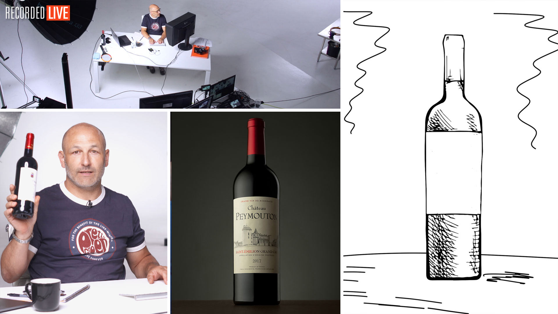
For our second ‘Working to a photography brief’ challenge, Karl tasked members with photographing a bottle of red wine on a grey background (an image based on one of his own previous shots).
In this live show, Karl reviewed each of the submissions and offered his feedback on the results. Some of the challenges members faced included achieving the correct lighting on both sides of the bottle; creating the desired mood; and achieving the correct perspective. Throughout the show, Karl offered tips and advice for interpreting and executing professional photography briefs such as this — a key skill for any photographer.
Designed to be achievable with studio lights or natural light, Karl also demonstrated how he achieved his own natural light version of the image using a large window, some diffusion and white card.
You can view the original brief for this challenge here. If you have any questions about this show, please post in the comment section below.
Comments
Hi,
If it helps anyone struggling to find Lee 216 diffusion material, I recently bought a couple of rolls from the following supplier:
https://www.thomann.de/gb/lee_farbfolie_rolle_216_w_diffusi.htm
Hi thanks James but please note that this is only the 123cm wide rolls. I use the 150cm wide rolls. I’m currently working on setting up a trusted supplier of the 150cm wide rolls.
My photo at 1:01:40 – you say the light has ‘slight blemishes’ and ‘maybe it was not clean enough’. Unfortunately, I don’t really understand what you mean. I’d like to know where I can improve. Is it the diffusion material I used? My studio flashes? Was the bottle, maybe a bit smudged?
I enjoyed the exercise anyway, it really made me super observant on light hitting the bottle.
Karl you are an amazing professional and eloquent instructor. I owe much to you. But nowhere in the original brief was the phrase “homogenous lighting” used. All that was asked for was “less diffused” lighting on the right side of the wine bottle. That’s what I shot for, yet you used that term against most everyone in your critiques. Not being rude, just confused.
Hi Edward, thank you – but a sample image was supplied as the mood board and it was explained that this image was the brief standard. However in saying that the sketches were not as clear. In the next excercise we will have a more complex but even clearer brief!
Thank you, Karl! I love these brief assignments. Best real-world instructions with relentless critiques, keeping us on our toes. Please keep doing these!
Thanks Edward. More to come!
Hi Karl,
I noticed you have difficulty pronouncing my name, Google translator from English to Portuguese on the speaker option will help.
(It’s the only way I can think off)
About the brief I took the photo on a grey card board,I don’t know how it ended up looking mottled, maybe the light I don’t know…on my screen I didn’t notice it,but I will find out what it was.
Looking forward to the next brief!!
Thanks, I’ll try the translator! 🙂
Hi Karl, another very useful brief challenge.
I do, however, wonder if trying to get as close to your shot as was possible is not especially representative of real life where mode boards, sketches and conversations form the specification.
Please, don’t take this as a moan, as I used the words and sketch, along with your photo to guide my submission and I’m not especially bothered about any perceived ‘ranking’, as your comments on all our entries is what helps me learn – as well as solving the problems at shooting time. It’s just that I’m guessing a brief to effectively replicate a previous shot is not what happens, normally. Perhaps next time it’s just words and sketches …?
These sessions are very useful.
As an aside when is Tasty going to be judged ?
Thanks for your good work …
Hi Barry, yes these are good points that have been raised by other members. In the next brief I’m going to be clearer with the requirements and/or the level of freedom to interpret.
Hi Karl,
thank you for these format and the critique.
At first it was a little bit hard for me but ok. So I will try harder the next time. Unfortenatly I missunderstand the ‘Clearly lit label’ statement in the brief. I remember that you show how to lit the label sepratly in on lesson, so I try hard to lit the label, and looks like it was too much.
Greeting,
Thomas
Hi Karl. I want to ask, I did not see my photo in the show from the brief, is there a specific reason for this? Thank you.
Hi Alecks. We’re sorry to hear this. A member of the team will be in touch with you to resolve this.
Thank you. It’s no problem. I just wanted to know did I do it right . Thank you.
Hi Karl
Thanks for a good show. It was my first time ever doing a productshoot, so i was very happy to be in
“the close to brief” folder 🙂
I learn alot on these criticue-shows and all the liveshows.
Thanks Tommy.
Thanks for the feedback on mine! Looking at the tif I don’t see that patchiness that is so obvious on the video. Looking at the jpg on my PC do see it so think something went wrong with the export I presume(?) and (foolishly) didn’t load jpg before submitting as got my timezone conversions wrong so rushed the upload 🙁 Was fun to try anyway. I was using the lee 216 and same size softboxes as you had in the training version so would that big line in the middle in particular be that I didn’t have them far enough away or too close or wrong angle to the diffusion? Could also be something else in the room (C-Stand maybe?) reflecting?
Hi Karl, the team!
Thanks for your feedback Karl! I was happy to hear that the perspective was absolutely perfect :):) took me some tries to figure it out I must say.
I have deleted the blue color (due to the color temperature of my flashes, I need to check that now ) from the background and reflections and posted the V2 in the FB group. The image feels nicer indeed 🙂
I wanted also to share below link with the group as there is a German company selling the Lee filter 216 diffusion rolls on-line, if this can help!
https://m.thomann.de/fr/lee_farbfolie_rolle_216_w_diffusi.htm
KRs
Slim
Thanks for the link although that diffusion is only 123cm wide, the one we use is the 150cm wide.
Hi Karl (and all the staff)!
Thank you for all!I really appreciate the comments!!! Greetings from Mex
José Antonio López
Great Show, Karl. Loved seeing so many Argentinian wines. Congrats to the winner!!!!
Hi Karl
Thoroughly enjoyed working on yet another great challenge.
Of course I want my shot to be chosen as the winning entry, but my target is to be in the top group of images. I’ve just missed out on this by one group on both challengers so far but I’m exceptionally determined and will get there!
Understandably you had to breeze through the images that were in the ‘nearly perfect’ folder, however it would be incredibly helpful to receive quick feedback as to what kept my shot from the top group.
Keep doing these challengers Karl – they keep us on our toes.
Ps – what about offering three free months subscription to KTE for the winning photograph going forward? In fact be a devil, make it six months 🙂
Cheers John
Hi John, thanks for the feedback and glad you are enjoying the challenges. At the moment we are not able to provide any prizes for these challenges, especially as I want to include more of them. We already give away over $10,000 of prizes per year in our members competitions, such as Siros kits, Cameras, etc – we also only charge a low monthly fee for membership, nearly half the price of some of our competitors who have no where near the level of content and they don’t give anything away. We are currently working on a new members galleries area that will supercede the competitions and we will be integrating an awards and prizes system as part of that with things like most improved photographers, best critiques, etc etc. Thanks Karl.
Exciting times on KTE Karl, thanks for the update and look forward to the next challenge.
Hello Karl,
Thank you for your critique. I have to admit that I was nervous like back in the day at school before some exams 🙂
That’s a good sign 🙂
It was a CGI image (38 min mark), thank You for the critique!
Thanks for letting me know.