
Clinique Post-Production 6: Final Adjustments
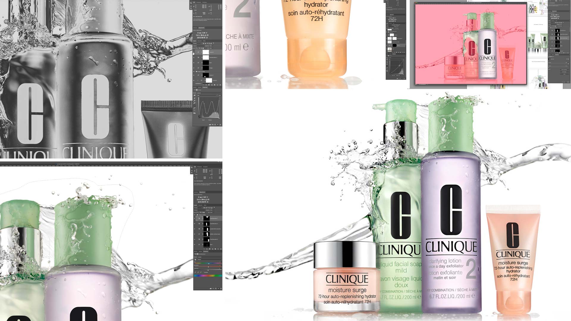
In this final chapter of the Clinique post-production course, Karl applies the finishing touches to enhance the overall freshness of the image.
In this class Karl uses burn and dodge to increase three dimensionality and contrast in the bottles and caps and also uses a solar curve (download this visual aid layer here) to even the tones throughout the bottles. These subtle yet effective changes, coupled with his additional colour adjustments go a long way in enhancing the image.
After applying some final colour adjustments to the bottles, Karl then finishes off by enhancing the contrast in the water splash, another subtle yet important change that helps achieve that fresh Clinique style.
To see how this image was shot, watch the Clinique Style Advertising Shoot classes or read my blog post on ‘Identifying & overcoming the challenges of a high-end product shoot‘.
In this class:
- How to use burn and dodge to enhance contrast
- How to smooth products using visual aid layers and burn and dodge
- Using solar curves
- Colour adjustments on bottles and caps
- How to use curves adjustments to increase contrast in water
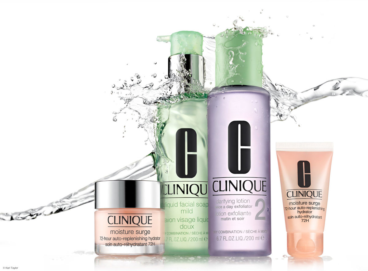
The final Clinique advertising style image.
Remember, if you’re unfamiliar with the techniques covered in this class, you’ll find additional classes on essential Photoshop tools in our Post-Production section.
- Watch Photoshop for Photographers
- Watch Advanced Photoshop for Photographers (presented by professional retoucher Viktor Fejes)
If you enjoyed this class, you may also find our Floating Cosmetics Splash Shot and the corresponding post-production class useful.
Questions? Please post them in the comments section below.
Comments
I sujets you keep your main window the largest as possible because looking to your video from a large iPad I cannot see the modifications you make when your main window is small in the middle of the screen, I am not sure why you do that since you have so much room on your screen.
I am at 47 min I think and cannot see what you are doing since the adjustments are so small you need to think of the different media people are going to use for your classes.
Why when you use select took to go around objects you always feather ?? What does it do, blur around it?
Very informative and fun to watch. This will cut hours/months off anyone’s journey to be a better product photographer. And THANK YOU for leaving in the mistakes. It makes us all understand that we have to constantly be thinking ahead, but this is complicated work, and mistakes are part of the process. Another important takeaway: Step away from the work and come back to it with fresh eyes. Can’t stress that enough! Beautiful end result. Better than Clinique in a few regards.
Thank you Murf17.
Hi Karl,
I just wanted to congratulate you on this tutorial. Knowledge and experience are obvious but most importantly I wanted to point out the patience this type of shots take. You didn’t cut any corners, neither shooting nor retouching and walked us throughout the whole process.
Regarding the post-production section, I have a couple of doubts:
– I personally don’t like the Clinique’s decision of using the black logo. I find it too aggressive and it’s hard to imagine a designer proposing a black logo keeping in mind the other soft and light colors on the packaging, that’s why the actual logo is silver. Besides, if you see the black logo on an advertisement, you would expect a black logo when you buy the product. So if you got an assignment from Clinique saying that they want to have the silver logo, how would you proceed? Since it would reflect the whole studio, would you shoot all products one by one in a smaller set controlling all the reflections like you were shooting jewels? Or maybe you would consider mixing photography with CGI? Or even hiring an illustrator?
– After seeing you doing white balance first and shifting colors after, how punctilious clients are regarding color accuracy? especially big brands. I know you are not a fan of the ColorChecker software but what other tools or processes can be used if you don’t much on the camera? Even some lenses cast some color. What is more important to them? Color, feeling, both?
Thank you .
Felipe
Hi Felipe, thank you. During the shooting stage I demonstrated the technqique to capture the ‘C’ logo in Chrome/silver as an option. I’m afraid I can’t remember exactly when that happened but I know it is in the tutorial. My guess is that Clinique choose black for the logo in thier adverts becasue it stands out more and brands are always after clarity. With regards colours, there are many variables but I do put a colour checker in for one shot when I have my lighting setup complete although I only use it as a neutralise tool and an eyeball reference. I actually make most of my final colour adjustments by eye on a calibrated Eizo screen whilst comparing to the product and then if critical the client makes proof prints that would match the output in magazines for final checking. Some brands of course saturate the colours more for advertising than they actually are, again simply to make the product message stand out more.
AWESOME! ❤ Thank YOU very much 😁
This project is a really good example of the complete lifecycle of a product asset production project.
It was a great exercise to sit over your shoulder and see how my intuitiveness did and did not match yours.
I’m sure that you’ve heard and otherwise realize that the post-production is personal and specific per each person. The tension/suspension of watching you in post is like a watch party for the Game of Thrones, for goodness sake. I was literally grimacing, delighted and surprised (often enough at the same time 🙃) while you took the steps you did to achieve your desired result.
It was fun and well done.
Thank you kindly!
to whom it may concern
hope this message finds you well.
I have a problem with my account. i have just paid $19 for this month and my account has not activated yet
Great tutorial, really complete and easy understanding 🙂
Just a question , I have the last version of Photoshop and it hasn’t the option of the solar curve. How can I resolve it ?
Hi Thank you, you can make your own and save it or use or Visual Aids Layers action downloads from our downloads section, from our Advanced Photoshop Course.
One thing I noticed, it is of paramount importance to have a larger screen with good resolution to check such smaller details.
( When i work on my MacBook, which inspite of having retina display – due to sheer small size of screen limits the ability to see and assess certain aspects/defects etc )
Am I right Karl, correct me please if I am wrong.
Thanks
– Sanket
Hi Sanket, Yes I always find it beneficial to have a large second monitor for checking fine detail.
Wow, such in depth-tutorial !
Finished it finally 🙂
Great to know the thought process behind each and every finer adjustment.
Thanks again.
Thank you.
at 16 min all goes out of focus!
Hi thanks for the info, I just checked and at 17mins it goes out of focus for 4 seconds, it must have been a problem with the screen recording software which we need to use to record what I’m doing.
Wow! I am so surprised of the inconsistencies of the Clinique product photos. Your thought process is very detailed. I never would have thought to use solar for anything. After seeing what you did and why…makes total sense. I agree these product do look fresh. Thank you for this tutorial from start to finish. I can’t wait to try something like this and then send in my photo for critique one day.
Great tutorial Karl, very thorough. Good to see how your thought processes work in getting things just right. Nice end result.
Thank you Andrew